I picked up the second issue of “Graveyard Orbit” after meeting writer John-Paul Kamath at New York Comic Con. I bought the comic not only due to Kamath’s convincing pitch, but his ability to summarize the story and why I’d like it.
Still, I approached it with a skepticism that the cigarette-smoking protagonist would ironically appreciate, but by the end of an issue, I became a total fan.
Jane Silver: A Nonchalant Badass
I don’t encounter many female anti-heroes in media, but the ones I find sometimes make me think ‘so…fe-Mal Reynolds’ because they can appear to be our favorite Firefly captain with a gender bend. In the case of Jane Silver, I didn’t think of Mal until I was part way through the comic, and even then only because she’s wearing a long brown duster and she mentions an attachment to the garment.
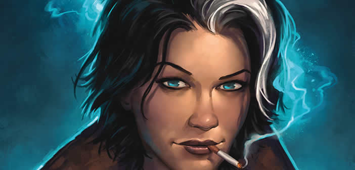
Silver is very much her own character; appearing middle-aged, she wears a fitted brown suit ensemble, sneakers, and a loose purple tie. Rather laid back until the action begins, we first meet our protagonist while she’s in handcuffs. She’s no angel, but being released provides an incentive for her to find some missing teens.
[Tweet “Read about Jane Silver, @gyardorbit’s nonchalant badass.”]
Silver’s cynicism implies some painful past experiences and she mentions a previous relationship that provides a bit of insight into her character. She isn’t written that way to keep up with a man, but because her present self is the result of her own experiences.
I asked Kamath about the inspiration behind Jane Silver.
I was sitting in a busy coffee shop one day when I observed a single waitress who was single handedly taking orders and serving a horde of rude customers with ruthless efficiency. She did this for a full hour while I was there, beaming smiles at people who believed her sole reason for being born was making them coffee.
Later in the evening when I was walking past the café, I saw the waitress sitting on the step to the shop, still in uniform having a cigarette and with her painted smile gone. She flicked her cigarette away and then went to finish mopping up. It was this image of a woman with a “hidden strength” and how she might be put to use by a truly helpless society or town of people that struck a chord with me.
I don’t think I have read a truly indifferent female character in comics, or at least one that stays indifferent throughout and at the end of the story. Like with the waitress in the above example: she gets on with her job, regardless of what it takes out of her each day. I guess this is harder to do with a continuing series where you continually have to show something of vital interest to the character, but with a single story you can paint sketches of characters a lot truer to life.
Silver slays comic book cliches and conveys compassion without losing her sense of self. This type of empathy display is something more female characters should consistently embody: she doesn’t have to sacrifice anything by helping someone else – in fact, she finds freedom in it.
[Tweet “.@gyardorbit presents a realistic character, imperfections and all, inspired by a real woman.”]
A realistic character, imperfections and all, inspired by an observation of a real woman: more writers should consider this approach.
Can a woman have value without displaying extreme empathy and visible emotion at all times? Yes. This one does.
‘Mature Readers’ Rating
I’m skeptical of any media featuring a female protagonist and a ‘mature readers’ rating. Sometimes, male-written tales go from character-driven plot to naked rape-fests really fast (I’m looking at you, “Game of Thrones” TV show).
Fortunately, this is not the case with “Graveyard Orbit #2.” Through the issue, Silver becomes empowered to solve problems (while remaining rather witty), and the rating is clearly and appropriately assigned due to language. Silvers uses the F word several times, but always realistically. I mean, what would you say if you ran into a werewolf?
Unless you’re offended by this type of language, don’t let the mature readers notification discourage you from reading this comic (or giving it to a mature young reader, at your discretion).
Gender and Presentation As Monsters
In the comic, both a male and a female human are presented as monsters.
The male, who clearly feels an emotional vulnerability, presents as an aggressive creature when in monster form. This reminds me of our society: men are not often encouraged to express emotion due to rigid gender roles, causing anger, frustration, and more societally acceptable aggression. While men may have some privileges, they have little room to present their true selves. If you sympathize with Marvel’s The Incredible Hulk, you’ll probably get this guy.
The female presents as emotional, vulnerable, and beautiful, though Silver remains cautious. She knows better than to think another woman is as simple as the glossy surface. When we find that the girl’s monster form is a serpent, it becomes clear: she was hurting within. Society permits outward vulnerability in women, but our ‘just smile and think positively’ culture often encourages women to hide away some of the darker, uglier, or unconventional emotions.
The realest part about Silver is that she recognizes this, judging by her concerned expression.
Art and Depiction of Female Characters
When Silver gets angry, there are lines on her face to underscore her emotion. Artist Drew Moss depicts confidence, confusion, and more by illustrating the characters from corresponding angles.
Bold colors (by Hi-Fi Design) convey mood, emotion, and contrasts boldly. The detail, clarity, quality of the illustration and color is complemented by glossy, premium paper. This comic is priced comparably to a DC or Marvel issue, but the value is justified.
Additionally, I’m willing to forgive a few typos or grammatical issues in small press or indie comics (even though it’s so hard to do that as a professional editor), but in this comic, I didn’t have to. The copy was clearly edited and I was therefore able to remain immersed in the story.
Recommendation
I love continuity in media, so I wasn’t sure I’d enjoy this standalone story (each issue of “Graveyard Orbit” is its own piece). However, the creative team effectively introduced and developed characters in just 24 pages. This isn’t an exercise in brevity, but in how writers and artists should work together to convey a substantial amount of information in limited space without overwhelming the reader.
Additionally, the pace and plot of the story are dramatic and even. The expository necessities a longer series must bear are nonexistent in the standalone format. As an aspiring comic book writer, I’ve learned more from reading “Graveyard Orbit #2” a few times than I have from instructional books and asking other creators about their methods.
With such a strong story, writers will particularly enjoy this comic.
To new comic book writers, Kamath offers the following advice:
Get a good understanding of story structure to help give shape to your ideas, but don’t use story structure as a means of coming up with ideas for your story.
The good thing about understanding story structure is that it’s extensible from short to long stories. How do you start a story with a bang? How are you going to keep the reader hooked and how will you pay things off? are questions all fiction writers fundamentally sit down to answer when they work, regardless of length.
That said, the writer who’s starting out should not work slavishly to structure right at the start as it can kill the fun of writing. Use it to solve problems with your story rather than the means of creating your world and your characters.
Thematically, I’d recommend this to fans of TV shows “Supernatural,” “Firefly,” and “Agent Carter.”
You can buy “Graveyard Orbit #2” online and in select London comic book stores. Be sure to connect with the creative team on Twitter, and don’t forget to read the writer’s inspiring message at the end of the comic, especially if you’re a creative yourself.
“Graveyard Orbit #2” is written by John-Paul Kamath with art by Drew Moss,letters and book design by Marty Ryan, colors by Hi-Fi Design, front cover by Matt Dixon, and back cover by Mario Alberti, Marc Deering, and Hi-Fi Design. Issue #3 has an expected publication date of June 2016. Pre-order your copy online today.
Review disclosure: I purchased my own review of this comic and have no material connection to the material or its creators.


